Antarctica Digital Museum
Transforming complex Antarctic research into an interactive digital museum experience that helps users explore, learn, and engage through storytelling.

Project Overview
This project redesigns Antarctic education by transforming complex research and scientific information into an interactive learning experience. The goal was to help users explore Antarctica through visual storytelling, guided discovery, and interactive activities.
The Challenge
Users were interested in learning about Antarctica but found existing educational resources overwhelming due to dense information and limited interaction.
- Parents wanted engaging activities for children.
- Travelers wanted authentic researcher stories.
- Students preferred visual explanations over long text.
The Opportunity
The opportunity was to create an immersive learning experience that balanced exploration, storytelling, and accessibility.
Personas

Maya
The Hands-On Parent
A parent and teacher looking for fun, interactive learning experiences that keep children engaged.
Goals:
- Find engaging ways for children to learn
- Navigate content easily
- Use interactive learning activities

Dr. Lena Foster
The Authentic Explorer
A traveler seeking accurate Antarctic stories and deeper connections with researchers and explorers.
Goals:
- Discover authentic Antarctic stories
- Access accurate research content
- Explore immersive experiences

Jordan Lee
The Visual Quick-Info Explorer
A student who prefers visual explanations and concise information for understanding complex topics.
Goals:
- Understand complex topics quickly
- Find concise visual explanations
- Scan information easily
Information Architecture
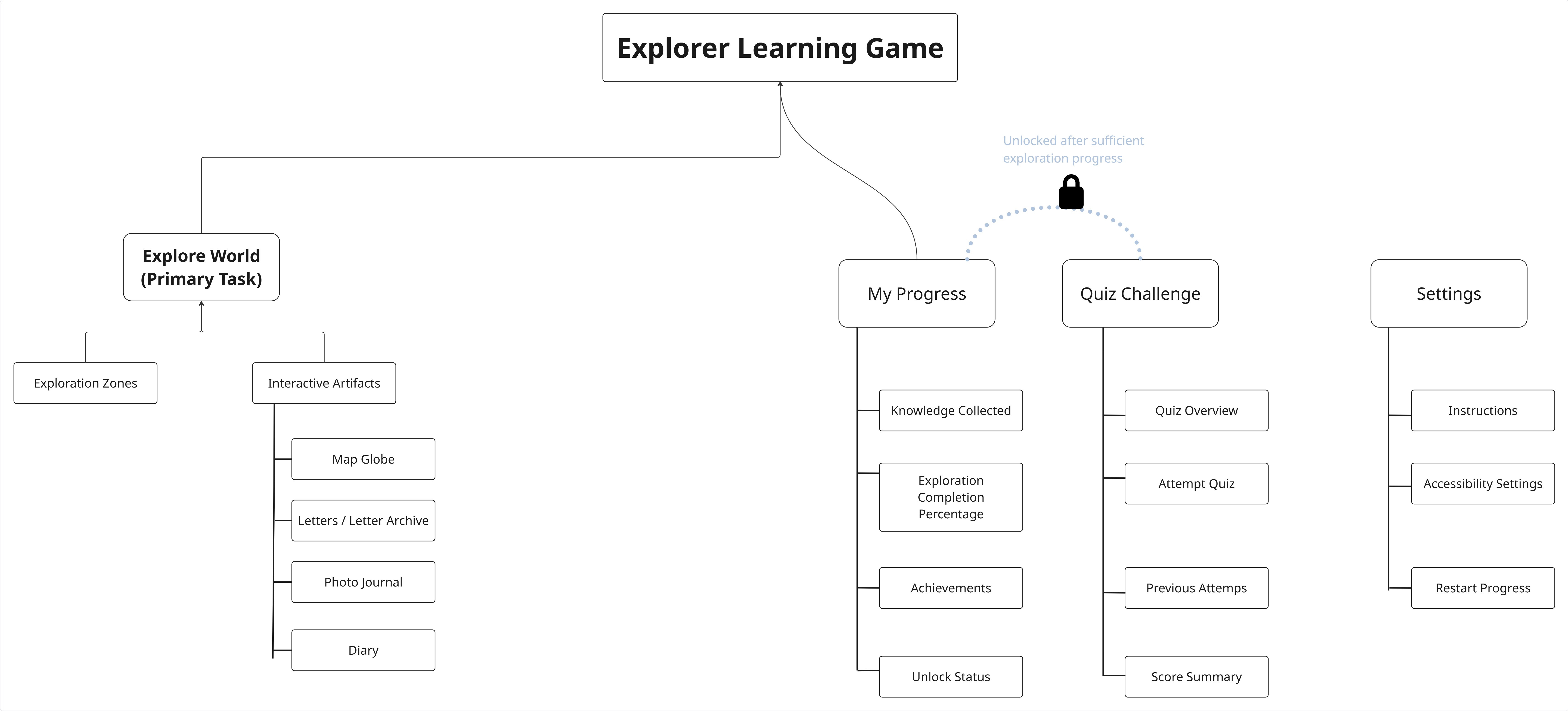
I mapped guided and exploratory paths to balance structured learning with free discovery.
User Flows
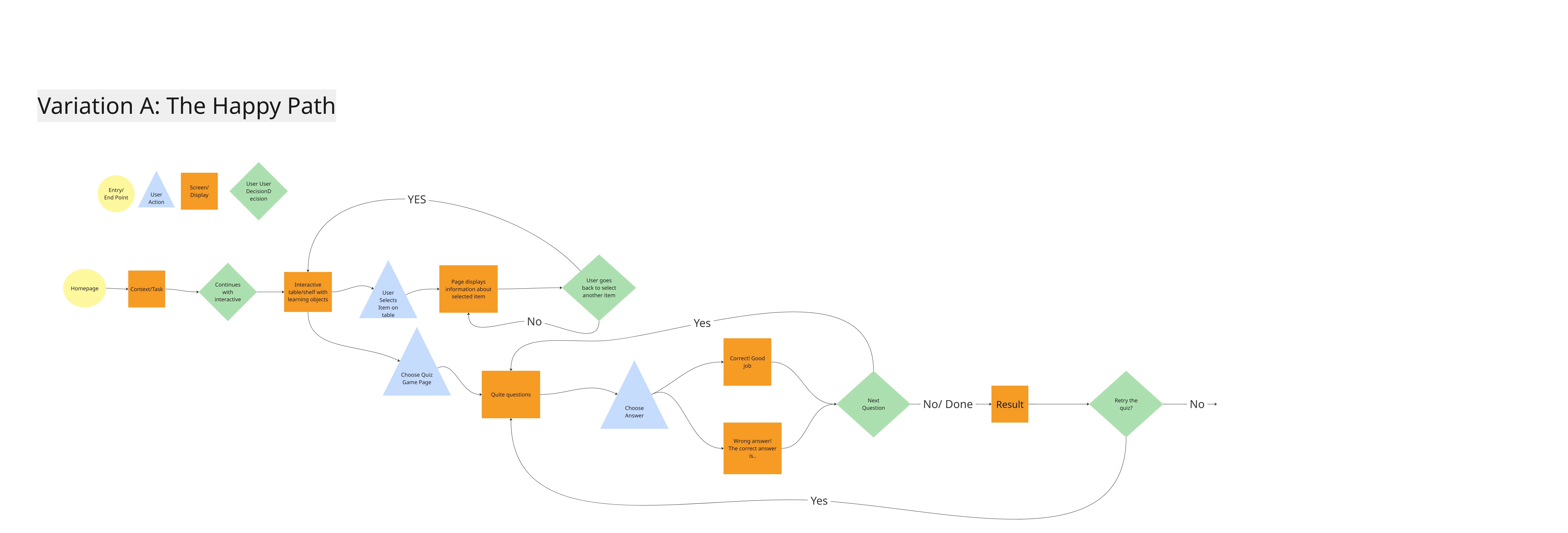
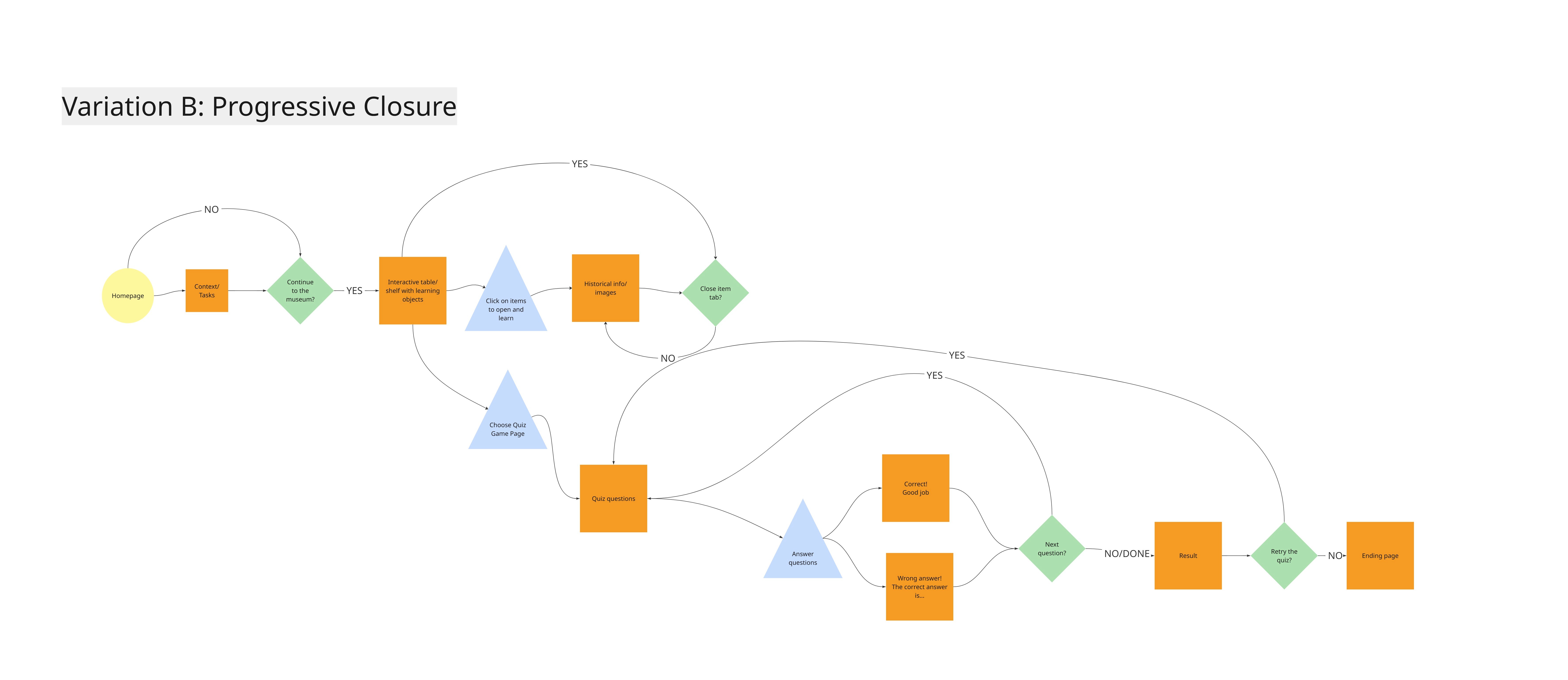
I created user flows to explore different ways people might use the experience.
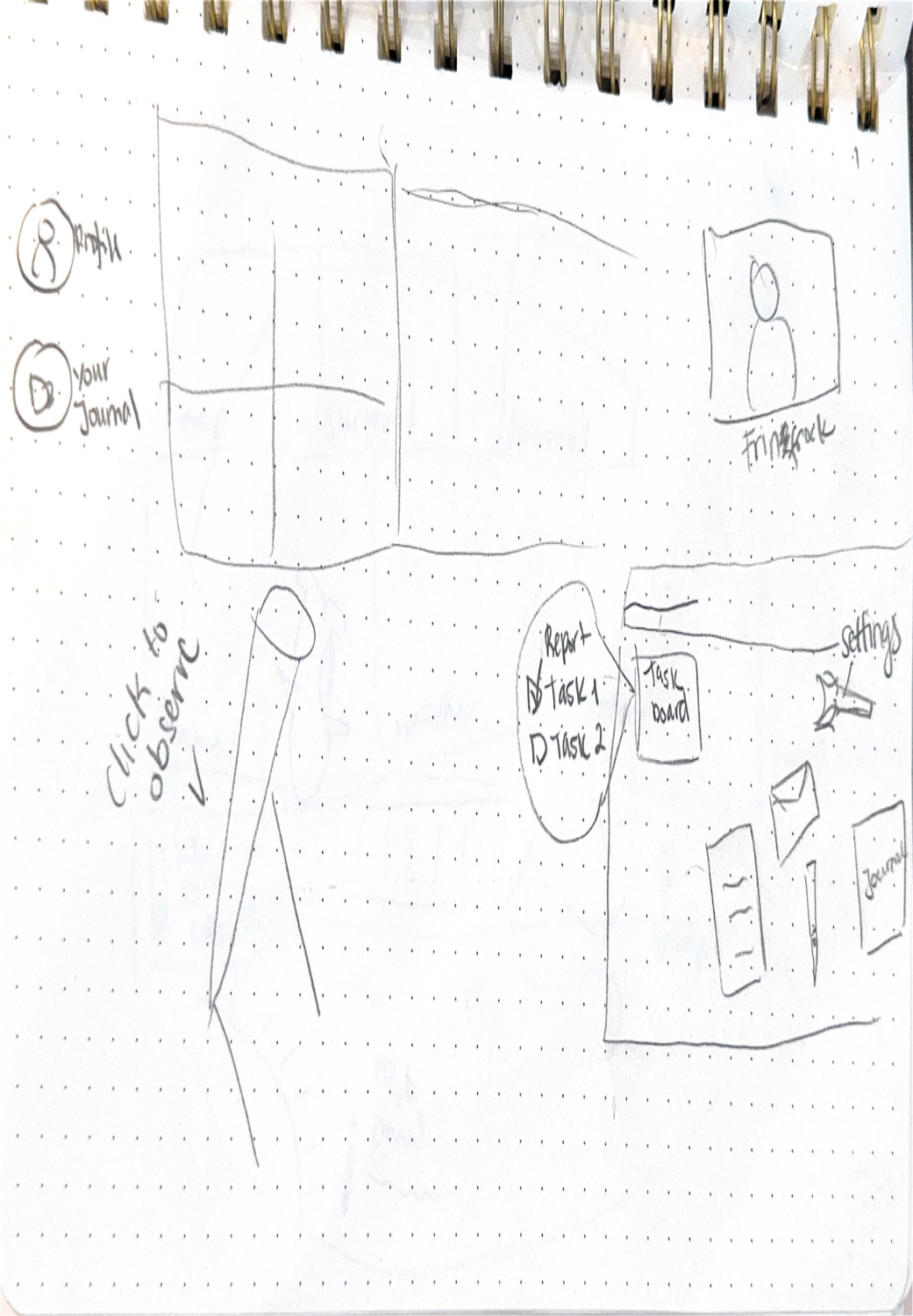
Initial Sketches
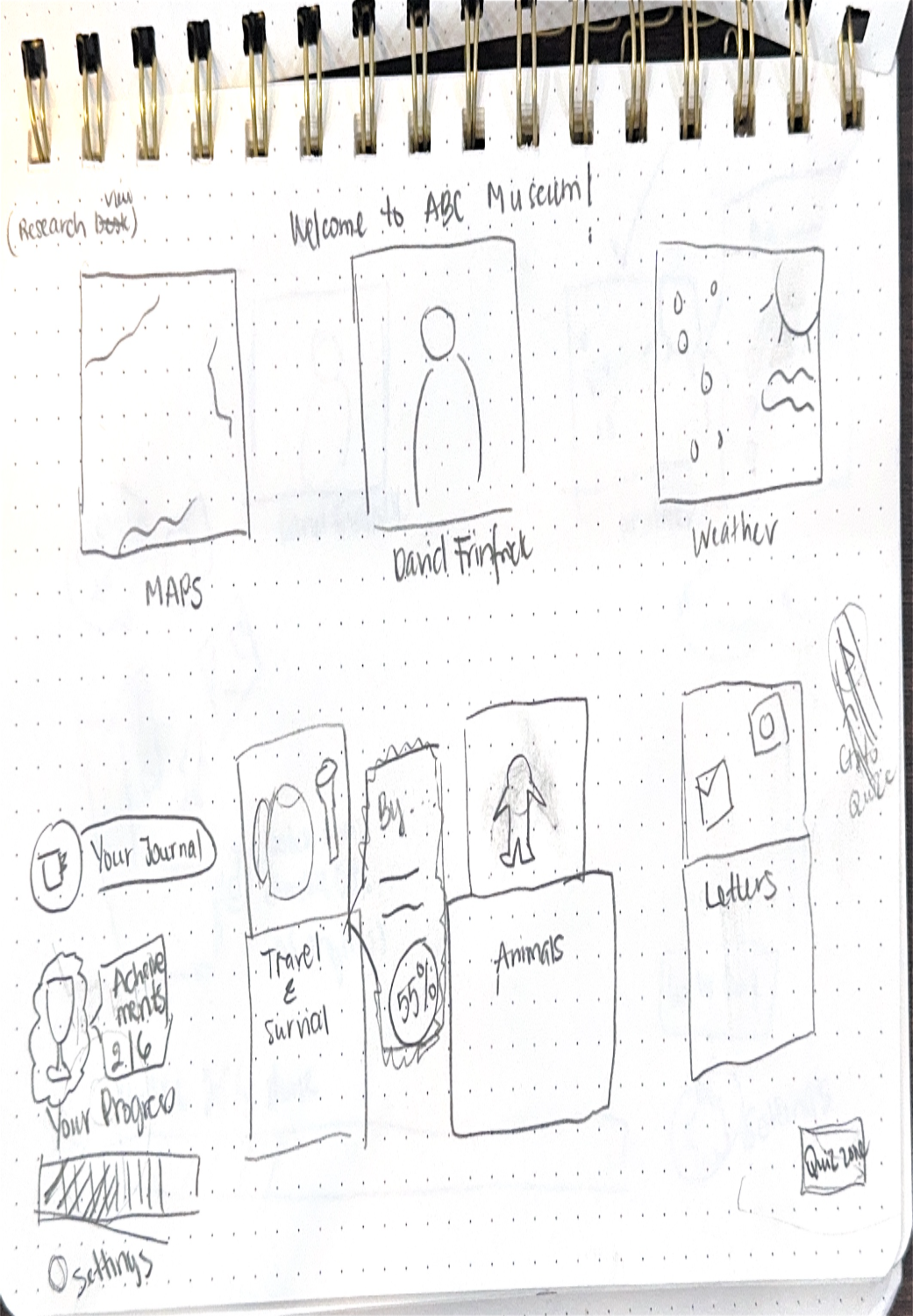
User flows informed early sketches exploring different navigation patterns. I tested interactive objects and traditional menus to understand how users could balance curiosity with discoverability.



Concept Testing
Early testing showed users enjoyed the interactive concept but needed clearer navigation, stronger visual guidance, and easier ways to discover information.
Key insights:
- Users preferred visual and interactive learning over text-heavy content.
- Clear interaction cues were needed to reduce uncertainty.
- Progress indicators and quizzes increased motivation.
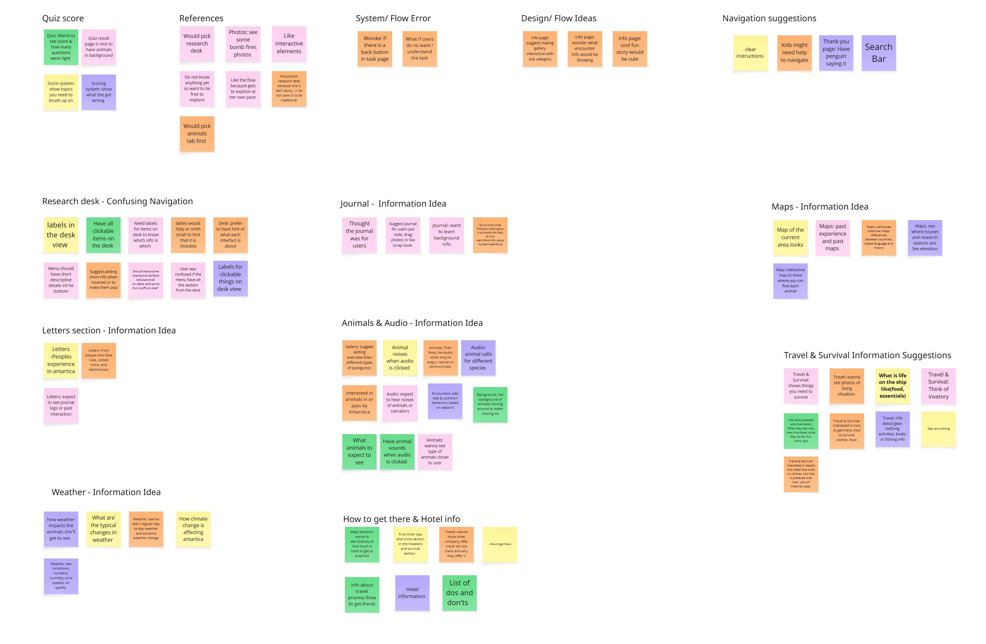
Key feedback themes included:
- Users needed clearer clickable cues and navigation support
- Participants preferred more visual and interactive learning experiences
- Quizzes, sounds, progress tracking, and exploration features increased interest
- Information needed to be easier to scan and less text-heavy

These insights directly informed design decisions, including adding onboarding guidance, galleries with photos, progress indicators, hover states, and more visual content to create a learning experience that felt both immersive and easy to navigate.
Comparative Testing & Design Decisions
I tested multiple concepts to determine which designs best supported navigation, engagement, and learning.
- 70% preferred the Museum View → selected for immersive exploration.
- 83% preferred direct role selection → replaced personality quiz to improve onboarding clarity.
- 83% preferred scenario-based quizzes → added images, hints, and explanations.
- 67% preferred badges and feedback → introduced rewards to increase motivation.
Mid-Fidelity Design
Using insights from comparative testing, I translated the selected concepts into mid-fidelity wireframes covering role selection, exploration, information pages, quizzes, results, and leaderboard screens.


Evaluation & Validation
After creating the mid-fidelity prototype, I conducted design critiques and heuristic evaluations to identify usability gaps before moving into high-fidelity design.
Key focus areas identified:
- Strengthen navigation cues and interaction clarity.
- Improve content hierarchy to reduce cognitive load.
- Reduce cognitive load on information-heavy pages.
- Enhance engagement through stronger visual storytelling and feedback.
These findings guided the final design refinements.
Final Design Decisions
Based on validation findings, I refined the experience across onboarding, navigation, information pages, quizzes, rewards, and accessibility to create a more intuitive, engaging, and immersive learning experience. The following screens showcase the first round of high-fidelity designs.


Initial High-Fidelity Testing
After creating the first high-fidelity prototype, I conducted usability testing to evaluate navigation, content clarity, and engagement.
Key Findings
- 83% of participants felt the experience was too text-heavy and lacked the immersive feeling of a museum exhibit.
- Users needed clearer guidance for navigation, role selection, and interactive elements.
- 50% of participants wanted more detailed quiz explanations to better understand their mistakes.
"I want to understand what I missed, not just see my score."
"It feels more like a menu than an adventure."
These findings guided the next round of iterations, focusing on improving discoverability, engagement, accessibility, and learning support.
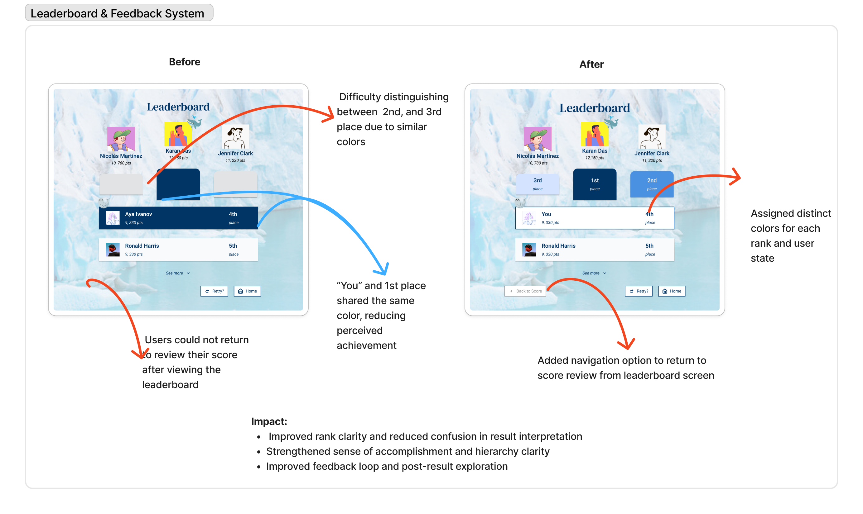
Iterating on the Design
Based on usability testing insights, I refined the experience through targeted improvements focused on discoverability, engagement, and accessibility. Each iteration addressed specific user pain points identified during testing.


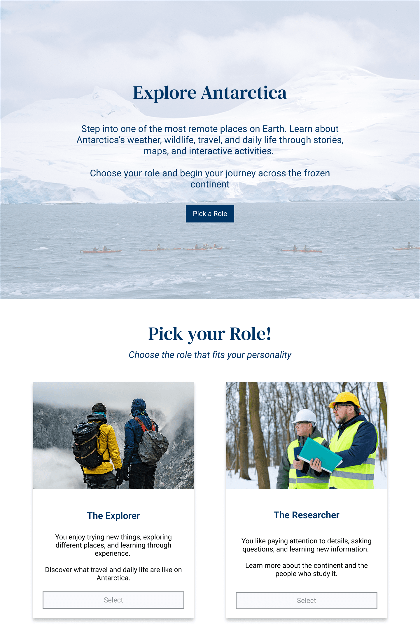
Final High Fidelity
The final design transformed the experience into a more immersive digital museum through improved navigation, stronger visual storytelling, interactive learning elements, and meaningful user feedback.



Final Testing Findings
After implementing the design improvements, I conducted a final round of usability testing to evaluate how well the revised experience supported exploration, learning, and engagement.
- Users navigated more confidently with clearer interaction cues.
- Visual hierarchy and expandable content improved readability.
- Quiz explanations and hints improved learning.
- Rewards and progress tracking increased motivation.
Users' Quotes
"Now I know exactly where to go."
"This is much easier to scan."
"The explanations help me learn."
"The badges make me want to try again."
Impact
Through multiple rounds of research, testing, and iteration, I transformed a static educational website into a more immersive digital museum experience.
Key Outcomes
- Improved navigation clarity through stronger interaction cues, progress tracking, and completion states.
- Reduced text-heavy experiences by restructuring content and introducing expandable sections.
- Increased engagement through scenario-based quizzes, hints, rewards, and leaderboard features.
These improvements created a more intuitive, accessible, and engaging learning experience that supported exploration, knowledge retention, and continued interaction.