Tutorify
Improving how students and parents find and book reliable tutors through trust, clarity, and simpler booking flows.

Project Overview
Many people feel uncertain booking a tutor online, especially if they're not very tech-savvy. Safety concerns, unclear credibility, and overly complex booking flows often stop people from following through. Tutorify was designed to cut down that friction by making trust signals visible, simplifying decisions, and creating a clearer path to booking.
Through research, structured flows, and rounds of usability-driven iteration, the final prototype reached a 95% task success rate with noticeably less effort across the booking journey.
User Interviews
I ran semi-structured interviews with five participants — three students and two tutors, ages 16 to 35 — all of whom had recently used a tutoring platform.
Research goals:
- Understand how users evaluate trust and safety
- Identify friction in tutor discovery and booking
- Learn how tutors promote their own credibility
Interviews confirmed that people lean heavily on visible credentials, predictable navigation, and simple flows when deciding whether to book.
User Quotes
"I have concerns about the safety and professionalism of tutors."
"It's challenging to find a tutor that matches my needs."
"There's a lack of support to reach potential students as a tutor."
Research Insights
Research surfaced consistent challenges across students, parents, and tutors alike:
- Users hesitate whenever a tutor's credibility is unclear
- Less tech-savvy users feel overwhelmed by complex interfaces
- Tutors struggle to showcase their qualifications in a meaningful way
These insights directly shaped the focus on verification, clarity, and streamlined navigation.
Competitive Analysis
A review of three existing tutoring platforms helped surface gaps and opportunities.
Wyzant — Strong on engaging animations, an easy-to-use interface, and thorough filtering, but held back by inconsistent layouts, some non-responsive elements, and tabs that open unexpectedly.
Kadama — A strong brand identity and a straightforward booking process, but booking is mobile-app-only, limited to English, with a weaker desktop experience.
Stutor — A good first impression, easy sign-up, and a responsive mobile app, but tutors are hard to find, scrolling lags, and the visual hierarchy is inefficient.
Key takeaways:
- Strong visual design alone doesn't build trust
- Inconsistent layouts and navigation reduce confidence
- Clear information hierarchy and responsive interactions are critical
This reinforced the need for consistent layouts, visible trust indicators, and fewer disruptive interactions.
User Personas
Two primary personas came out of these research patterns: students and parents who need a safe, simple way to book a tutor with confidence, and tutors who need a clear way to present their qualifications and stand out.
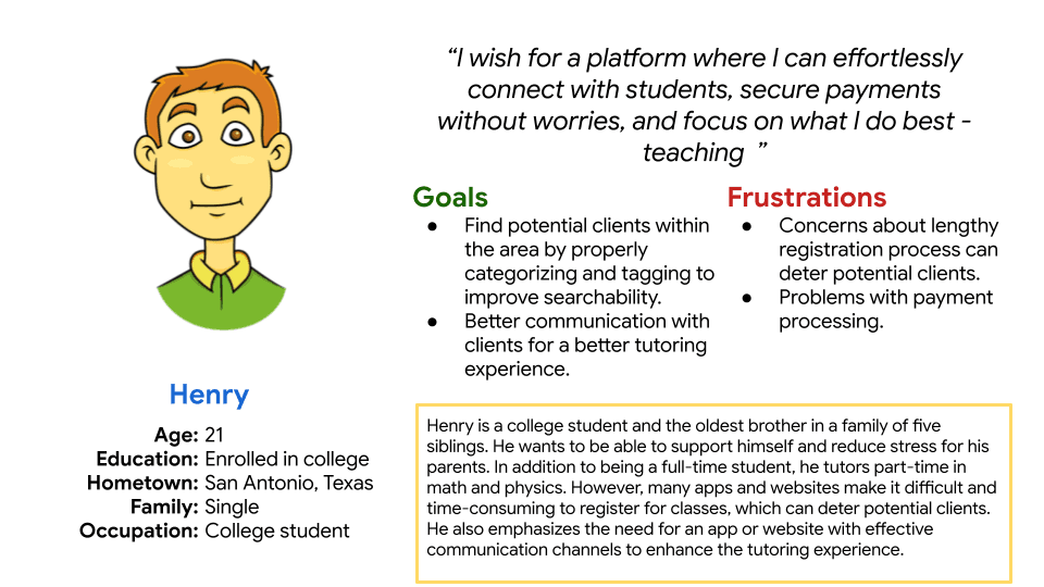

These personas guided decisions like prioritizing tutor verification, surfacing reviews early, and designing a straightforward booking management flow that supports recurring sessions.
User Flow
I mapped the end-to-end booking flow to find the moments where users hesitated or abandoned the task. The biggest friction points showed up during tutor comparison, credential review, and scheduling.

Mapping the flow out helped cut unnecessary steps, clarify navigation, and shape a more confident path from search to booking.
Sitemap
The sitemap organized Tutorify's content around user goals, from discovery through booking management — key pages included tutor search, profiles, verification, booking, and session management.

This structure supported intuitive navigation and made sure trust-related information was always accessible right when users needed it.
Paper Wireframes
Early sketches explored layout ideas addressing the research-driven pain points, with emphasis on clear navigation, visible ratings and reviews, and simplified content for less tech-savvy users. Iterating quickly at this stage helped prioritize clarity and usability before adding any visual detail.


Mid-Fidelity Wireframes
Sketches were translated into mid-fidelity screens in Figma to refine layouts and validate the flows before building a functional prototype — making sure interactions were clear, layouts were usable, and navigation matched what users expected.


Mid-Fidelity Prototype
I built a mid-fidelity prototype in Figma to test navigation and core interactions — users searched for tutors, reviewed profiles, and managed bookings. Feedback from these sessions shaped usability improvements before moving into higher-fidelity design.

Usability Testing
I ran remote, moderated usability testing using a cognitive walkthrough method.
Participants: 5 (students and tutors, ages 16–35)
Focus tasks: Search for a tutor → Review profile → Book a session → Manage bookings
Task completion rate: 75% (9 of 12 tasks completed)
Testing surfaced hesitation around scheduling, limited navigation control, and repeated effort when booking recurring sessions.
Affinity Mapping
I synthesized the usability testing notes through affinity mapping to uncover patterns in where users hesitated or abandoned a task — particularly during booking and tutor credential review.

This process surfaced clear problem areas and turned them into actionable opportunities, guiding refinements that reduced friction, clarified trust signals, and helped users complete bookings with more confidence.
Insights
- Rebooking a weekly session felt inefficient
- Calendar interactions caused misclicks and confusion
- Limited back navigation reduced confidence
Opportunities
- Add recurring booking options
- Replace the calendar with clearer date inputs
- Strengthen back navigation for easier comparison and correction
Iterations


- Replaced the calendar with a simple date input for faster scheduling
- Added recurring booking functionality to cut down repeated effort
- Fixed navigation and button responsiveness for smoother interactions
Final Design Mockups
The final designs focus on trust, clarity, and ease of use.


Key features:
- Clear search and filtering for quick tutor discovery
- Visible reviews, ratings, and verification to build confidence
- Simplified booking management for tracking sessions and recurring bookings
Overview
Tutorify helps students and parents find reliable tutors with less uncertainty, while giving tutors clearer ways to build credibility and connect with learners.